Designing a connected creator economy experience.
Orbiiit connects artists, musicians, influencers and other creators with fans, brands and agencies. It brings together talent competitions, fan voting, rankings, social analytics and professional media kits across a responsive website and a mobile app. As Product Designer, I worked across these experiences with product stakeholders and developers.
The challenge
Orbiiit serves people with very different goals. Creators want visibility and professional opportunities. Fans want to support contestants and follow their progress. Brands and agencies need a fast way to find and evaluate talent.
The job was to connect these journeys into one coherent product across web and mobile, so that a contest, a creator profile and the app all feel like parts of the same experience.
01 — Participation and voting
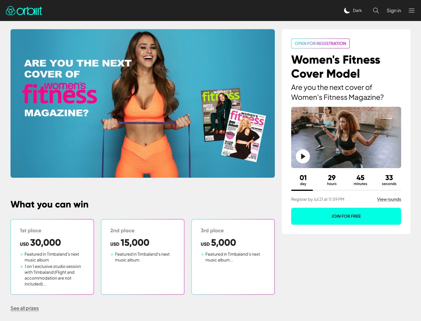
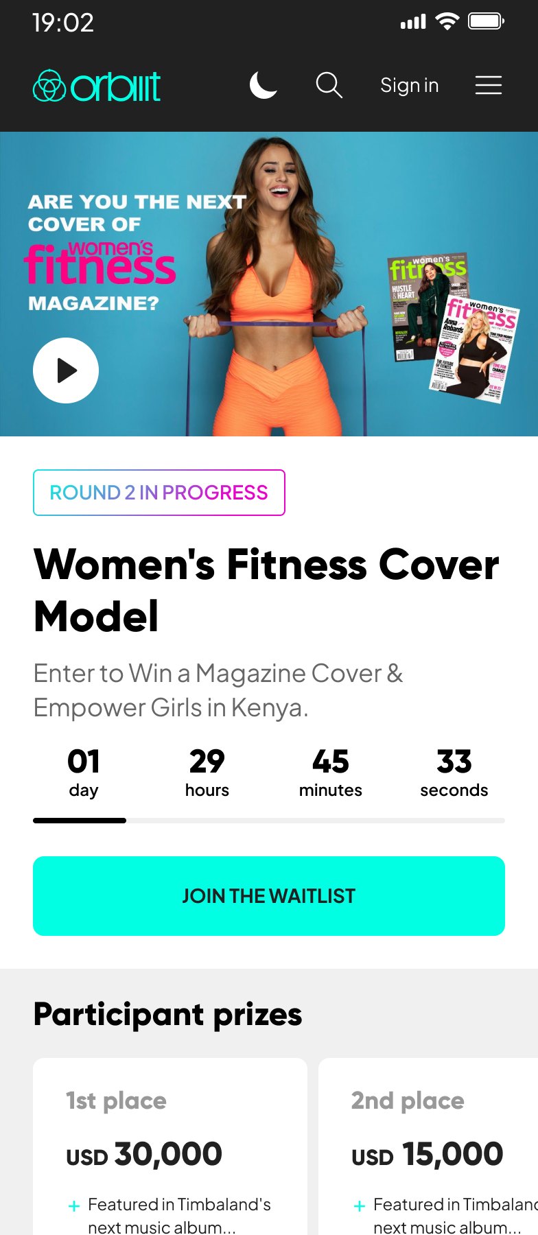
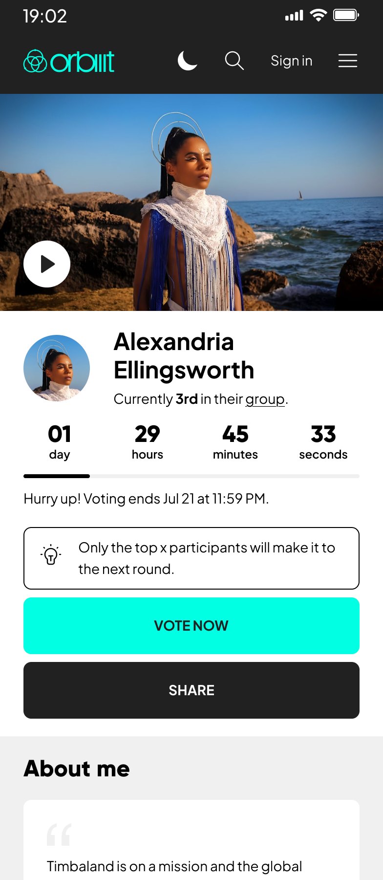
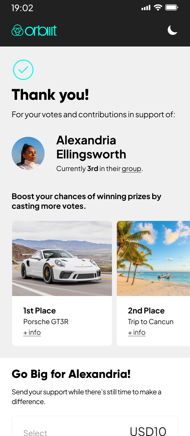
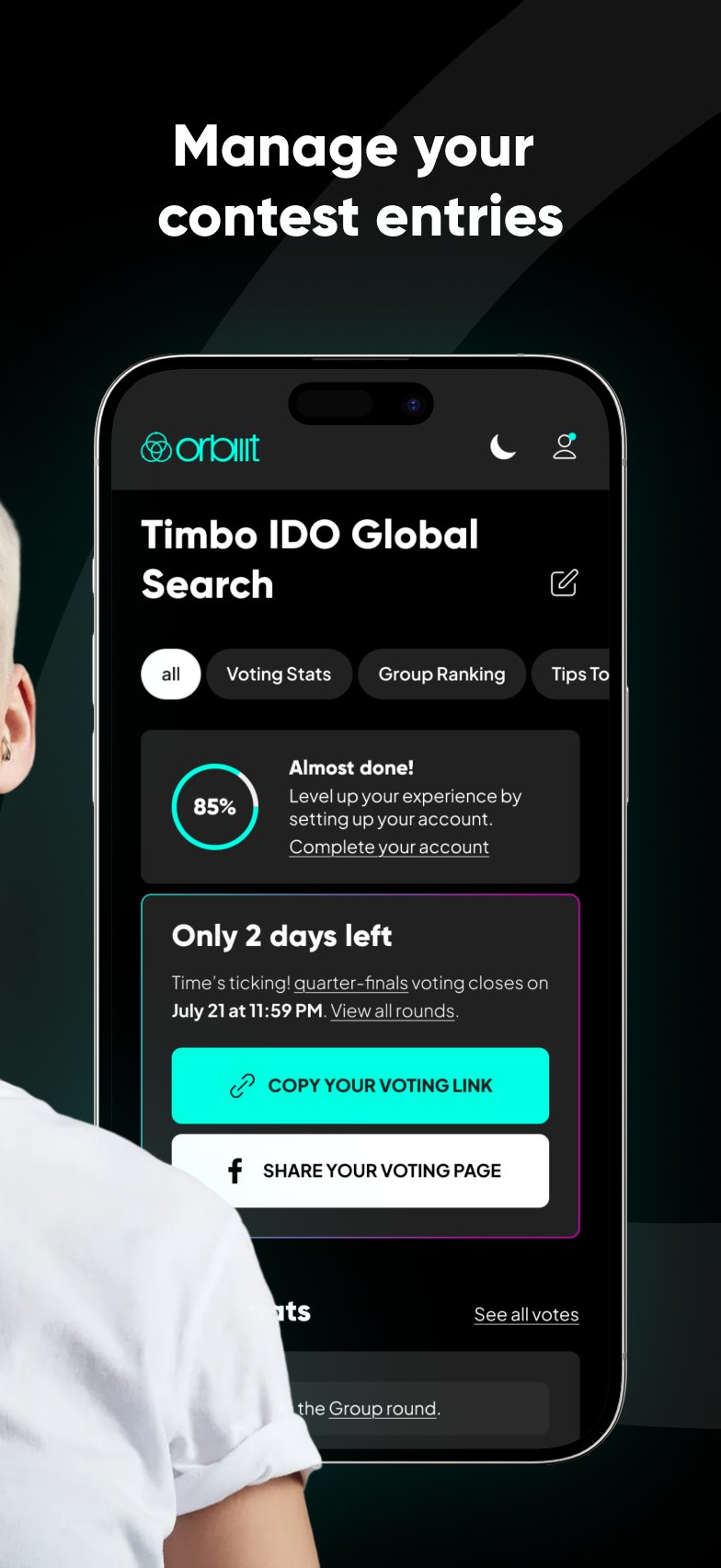
Competitions are where most creators and fans first meet Orbiiit. On mobile, I designed the contest and contestant pages around what matters in the moment: who is competing, how much time is left and how to vote, with prizes, judges and contest details further down.
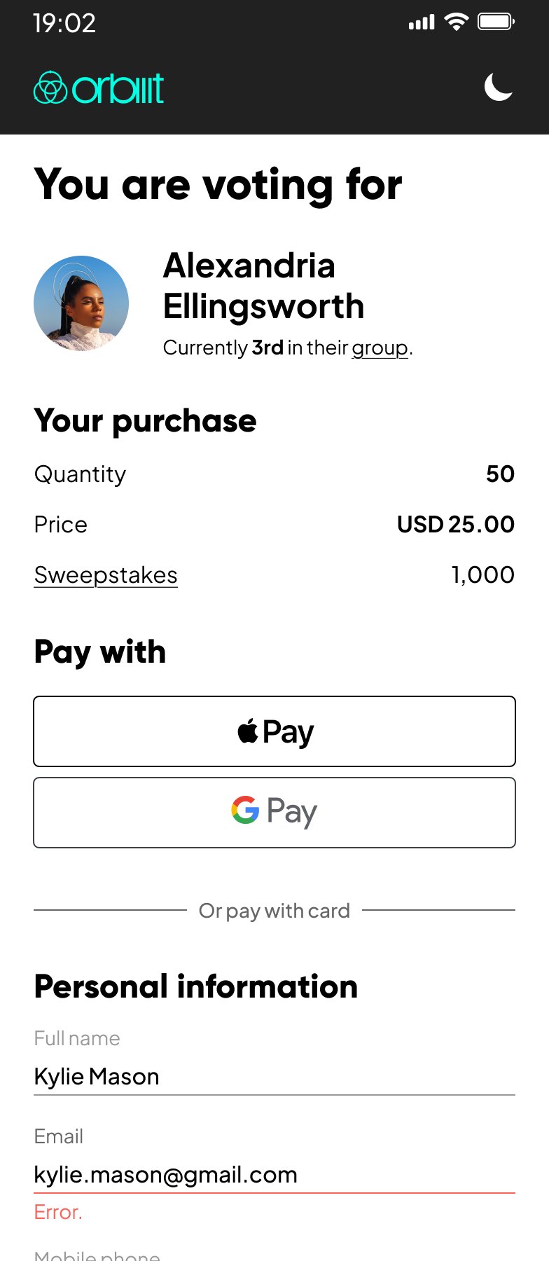
I worked on the free and paid vote flows, and on the journey creators go through after applying: review, approval and account activation. I wrote messages and calls to action for applicants who already had an account and for those who still needed one, so the next step was clear in both cases.
02 — Turning social data into professional value
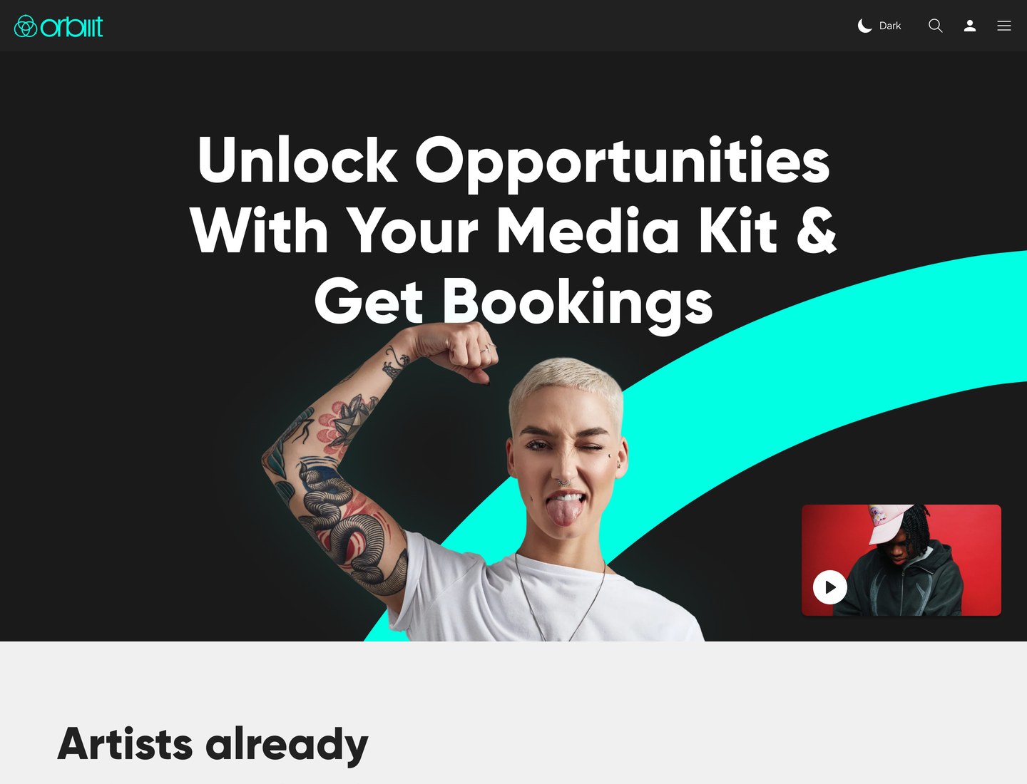
Creator profiles and media kits turn social performance, rankings and personal information into a professional identity that brands can read quickly. I organised the content around a clear hero, used compact trend charts for growth and ranking, and kept secondary metrics behind expandable sections so the essentials read first.
Rankings are shown in global, country, city and home-town contexts, and location makes clear where a creator lives today and where they are from. The same patterns carry into talent discovery, where brands browse and filter by platform, category, niche and location instead of searching for a name they may not know.
03 — A mobile companion
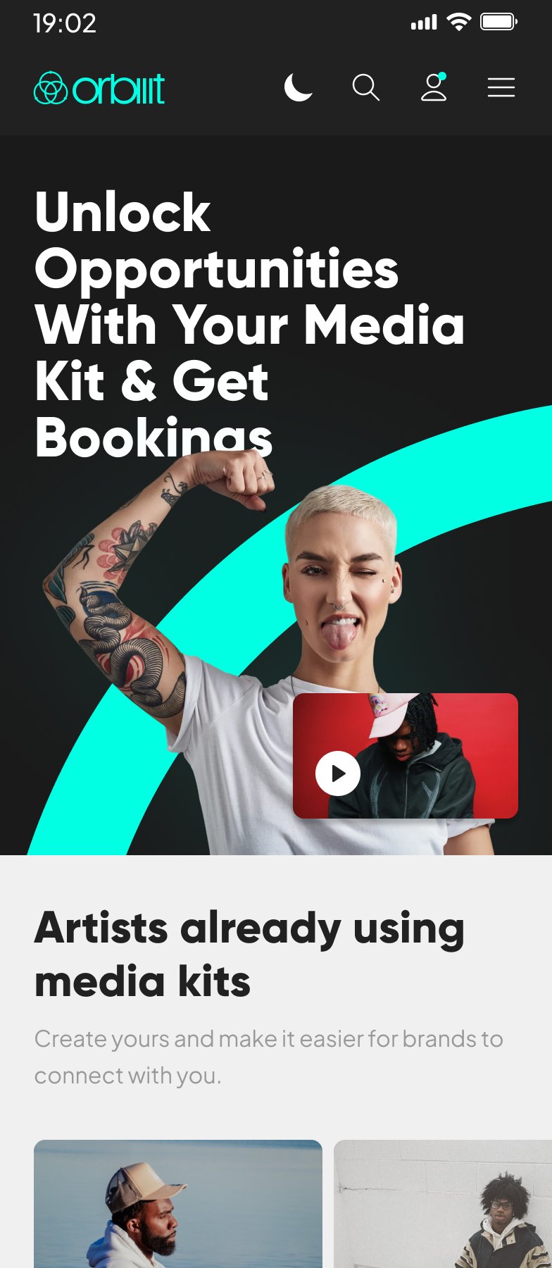
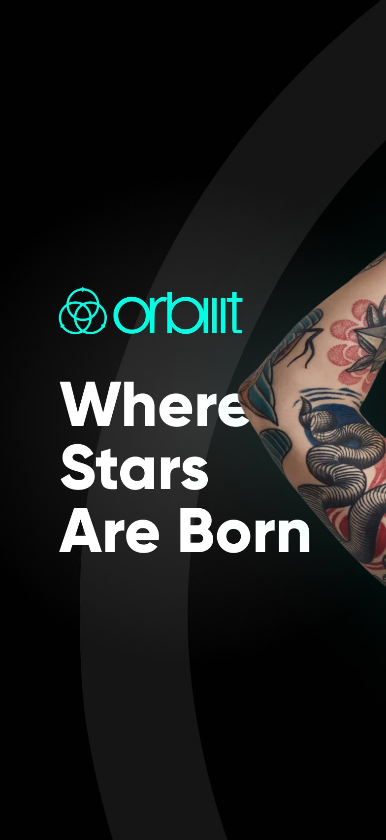
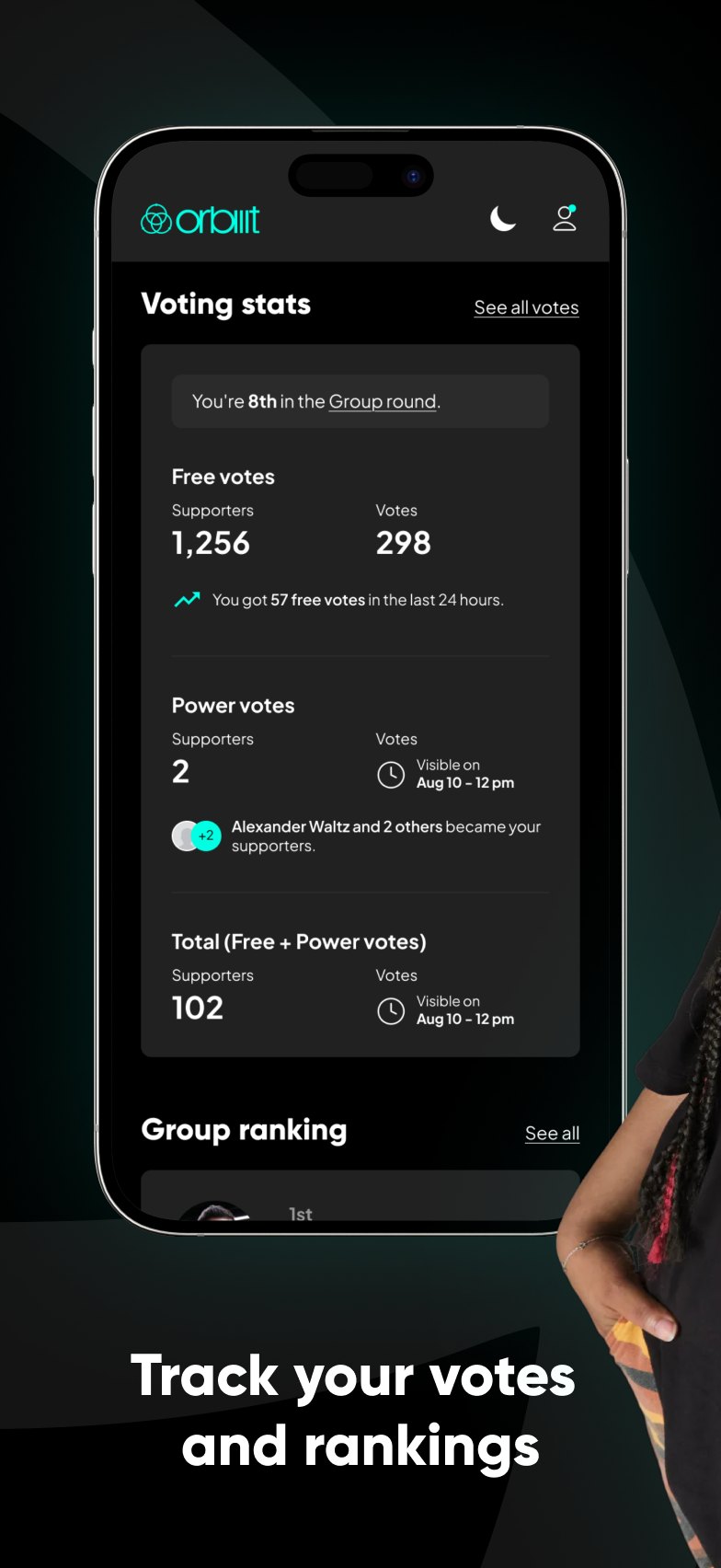
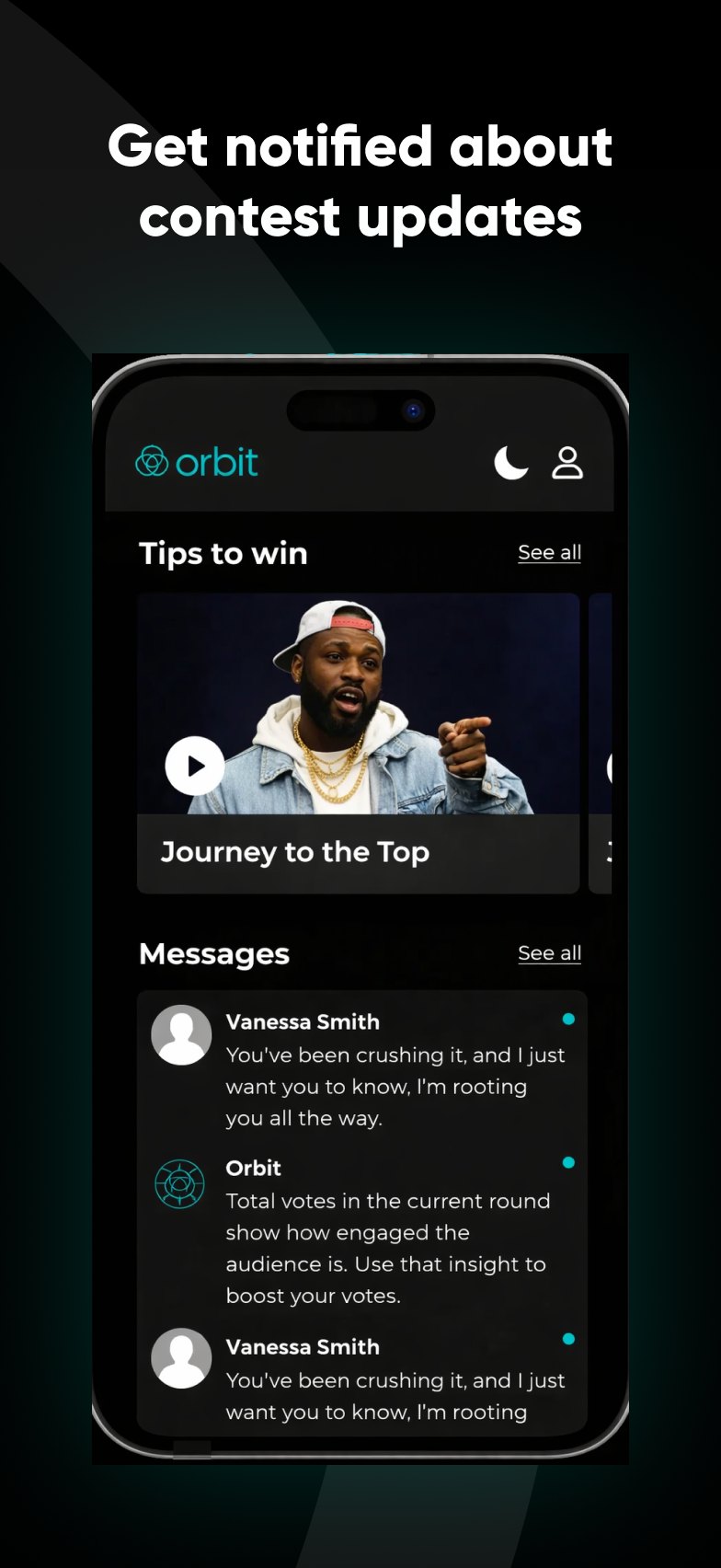
The app started as a dashboard for creators to manage their contest entries, track votes and rankings, and hear from fans. I defined how screens adapt across devices, keeping backgrounds, illustrations, logos and controls as separate assets so layouts stay flexible without losing visual quality.
For notifications, I separated what matters to each audience: a new vote is news for the creator, while a ranking change gives a fan a reason to come back. When the team considered moving registration into the app, I reviewed how that would affect website calls to action, campaign links and existing journeys before the scope changed.
Key decisions
Discovery over search
Brands often know the kind of creator they need, not the name, so filters, rankings and attributes lead.
Clarity over density
Clear hierarchy and progressive disclosure let people get the essentials before the details.
Value before registration
We explored partially gated results while weighing the friction they add before people see the value.
Ranking in context
Global, country, city and home-town rankings make the numbers meaningful to more audiences.
Journey over scope
Moving features into the app meant checking every entry point first, not only the new screens.
Flexible assets
Separating visuals from controls kept responsive layouts sharp across screen sizes.